top of page

Vynoa
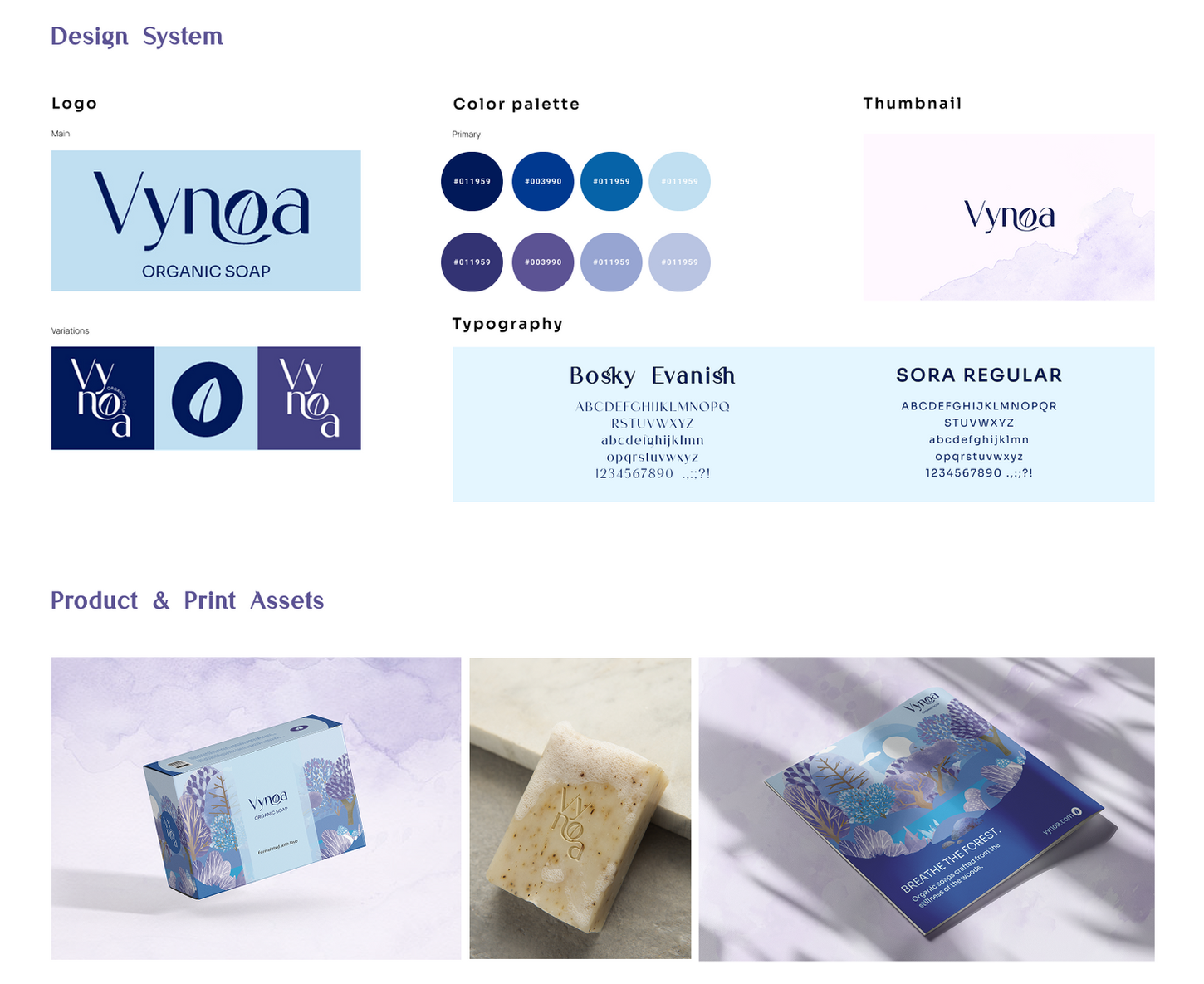
Vynoa is a serene and organic brand inspired by the stillness of the forest. Originally developed as part of a visual identity system for a health-related project during my time at Clariness, it was later adapted due to client confidentiality for this product line of organic soaps.
Iconography
Branding & Identity
Client /
Vynoa - Clariness GmbH
GOAL >
Reinterpret a health-related identity into a lifestyle brand inspired by nature — retaining scientific clarity while evoking softness, calm, and sensory appeal.
MY ROLE >
Designed the full brand system: logo, color palette, packaging, and visual language, transforming an internal corporate project into an emotionally resonant consumer identity.
SOLUTION >
Combined watercolor textures and soft gradients with minimal typography to convey harmony and purity. The packaging and printed materials reflect calm sophistication, aligning nature, health, and emotion in one unified design.

bottom of page